Many FMs participate in benchmarking programs to see where they stand in comparison to their peers. To obtain good benchmarking results you need comparisons of similar buildings using filters to select the characteristics of the facility you want to compare. Do all benchmarking results do that? Not necessarily!.
Let’s look at what static benchmarking tables and charts can do compared to what an automated system can do. We then will see the value that on-line systems can bring to benchmarking.
We looked at report examples developed by some associations and benchmarking organizations to see what was available and how they approached benchmarking. Many of these organizations offer “free” benchmarking. That is, if you put in data, you’ll receive a “free” report.
But anyone who has gathered benchmarking information knows that the real cost of participating in benchmarking is the time spent in gathering the data. It doesn’t matter very much whether the service is free or costs a little to participate. The majority of the expenditure and effort is going to be in collecting the data.
How you input your collected data can also be frustrating or satisfying. Some organizations are still collecting information on paper forms and scanning or faxing the information to be compiled in a report. The time between input and receipt of the “free” report can be many months. If you’ve made a mistake and want to change an input you can re-submit or call someone to have them change your data. This process is annoying and error prone.
Let’s look at a typical organization’s static report. In the example that follows, the values have been changed to maintain the confidentiality of the report, which shows the various percentiles for gross square foot utilization per person.
| Percentile | Gross SF/ Occupant |
| 95% | 800 |
| 85% | 675 |
| 75% | 510 |
| 65% | 416 |
| 55% | 327 |
| 45% | 265 |
| 35% | 209 |
| 25% | 180 |
| 15% | 168 |
| 5% | 110 |
What can you possibly do with this information? It isn’t filtered by type of business, industry, LEED certification, age of the facility, location, climate, or any number of other possibly important factors. Clearly, certain types of facilities would be expected to have higher space utilization rates than others. While benchmarking maintenance or energy costs can save a fraction of your operating costs, because of the high cost of real estate, if you benchmark and realize your portfolio is larger than needed, you may be able to save very large amounts of money.
The problem that we surface here is that from the chart above, how are you supposed to figure out where you stand? The only way to do that is run the math yourself by finding your input sheets, hope you kept them, and calculating (Gross Square Feet)/(Total Employees) This is a real simple example. The complexity of figuring out where you rank goes up from here for the other important benchmarking metrics.
Let’s compare this with what you receive from an on-line benchmarking tool. We will use charts from FM BENCHMARKING to illustrate our point.
First, the data collection process is all on-line so there are no paper forms to fax in or call some-one to change a number if you made an entry error—you simply do it yourself at any time.
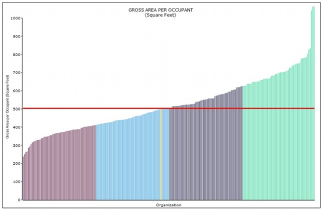
Then, as soon as you have input your data you can generate reports. In this example, our facility is a 1,125,000 gross square foot (GSF) facility, 22 years old, with 2,650 FTEs (full time equivalents) with a primary business function of aerospace products.
The first filter we will turn on is the size of the facility so that we will only consider buildings that are 600,000 GSF or greater. In the FM BENCHMARKING system this produces 449 facilities for comparison. In Chart I our GSF per Occupant is shown by the yellow bar at 500 GSF which indicates a performance just above (worse) the median company in this filter set.

However, just using the size filter by itself may not necessarily be a good comparison of our building performance. Space utilization is probably impacted by the type of facility, in this example, aerospace manufacturing. When we turn on the filters:
- Gross square area: 600,000 and greater Square Feet
- Aerospace Manufacturing
our performance moves into the second quartile (see Chart II).
What is really happening here is we are comparing our facilities with a better peer group. Our performance didn’t change (we still have 500 GSF per person)—our peer group changed.
As you can see, these significant changes in our ranking position are made simply by better peer group comparisons from applying filters. Until one is able to apply multiple filters, turning each one on and off after seeing whether it has an impact, one cannot be sure that one has the correct filter set for comparison, and thus, one cannot benchmark as effectively as possible.
Since one doesn’t know which filters will be most meaningful until one tries each one and evaluates the results, and since a static system can’t address each possible filter combination, we can better understand the value of an automated system. And let’s not forget the aforementioned benefits, such as the ease and accuracy in inputting and revising data, and having the data be current (not several months or even a year old).