by Laurie Gilmer, P.E., CFM, SFP, CxA, LEED AP O+M — In the December article, Sustainable Facility Management Reporting Choosing the Right Things to Measure, Chris Hodges addressed the importance of selecting the right data, the difference between metrics and key performance indicators (KPIs), and how to link them to the organization at both a tactical and a strategic level.
The data in facility management reporting is very important. How the data is presented is even more important. After all, the purpose of a Facility Management report is not just to convey information, but to engage the reader in what has been achieved and the future direction of the Facility Management team. It provides a platform to display accomplishments as well as a means of defining next steps and what is required to get there. This is especially important when this involves procuring financial, programmatic, and personnel resources.
A good report is supported by good data. A great report illustrates the relevance between information and the reader in an engaging and memorable way. In this article we will discuss how to tap into the human element.
- Know your audience. Who will be reading the report and what do you need them to know? Take advantage of the framing effect. The framing effect describes how different ways of presenting the same information can evoke different emotions, decisions, and outcomes. One of the classic illustrations is in food packaging in which respondents are asked which they would rather buy: meat that is 85% lean or meat that is 15% fat. Both products are exactly the same, however we recoil from the idea of a percentage of fat and instead prefer to focus on the lean product. Somehow it seems healthier and thus more desirable. Voila, the power of the framing effect.
In the context of an FM report, we need to convey information in a way that the recipient can most easily connect and relate to their own experience. Tuning the message to the audience will keep reporting relevant.
Lets assume your audience is your executive leadership team; you will need to frame your facility metrics in terms of goals and initiatives they care about. For example, if your organization has a goal to increase productivity, you may have an initiative to streamline the process for materials procurement. Your metric could be the number of trips saved or technician hours saved. Your report would then show that information through a productivity frame (refer to Figure 1).
 Figure 1. Streamlining Materials Procurement Improves Productivity
Materials procurement streamlining initiative increased productivity by 148 hours (18.6 man-days) since Q1 FY2014. - Identify the desired response. How do you want the audience to respond to your report? The FM report is a powerful tool and can be used to garner support for further initiatives. In the example of the materials procurement streamlining process, you may ask for additional support to reduce technician trips further. Stated in terms of a goal, you may indicate something similar to Figure 2.
Goal for Q2 FY2015: Increase productivity to 160 hours (20 days).
This will free up one month of a technician’s time each quarter to work on maintenance activities. We will need to out-source additional materials delivery tasks to our vendors to reach this goal.
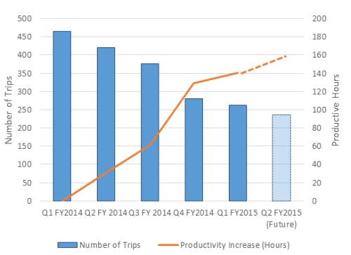 Figure 2. Streamlining Materials Procurement Improves Productivity
 - Use graphics. There is an expression in our culture, “A picture is worth a thousand words.” It is so well known that while most of us don’t quite remember where we first heard it, we do not question its veracity. Except in reporting. When it comes to FM reporting, we have a tendency to rely heavily on written text. In John Medina’s book Brain Rules, he highlights how visual memory (pictures) out-perform both sentences and words for recall in memory tests. In fact, people who were shown hundreds of photos were able to recall 90% of the photos three days later and up to 63% a year later. Pictures tend to be easier to synthesize quickly and stay in our memories longer.
Consider the case of a campus facility. Several buildings were evaluated and scored based on their overall condition. The Facility Management department planned to use the assessment information to support a request for capital funds, and to track overall condition of each building. For the sake of illustration, let us assume the initial report showed the summary captured in Table 1.
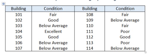 Table 1. Facility Condition Ratings by Building
Without looking back at the table, which building was in the best condition? Which two or three were the worst? Unless you spent a lot of time processing and memorizing, it is likely you would not be able to answer very quickly, and certainly not without looking at the table again.
Now consider a pictorial interpretation of the same data (refer to Figure 3).
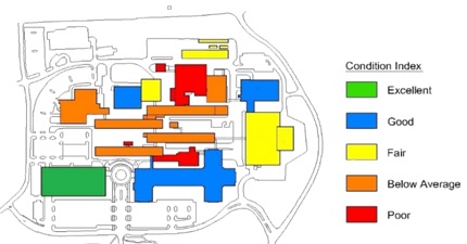 Figure 3. Facility Condition Ratings by Building
How many buildings are in excellent shape? How many are in poor shape? Most people find this graphic much easier to understand and remember. In fact, the organization utilizing this graphic was able to reference it in conversation from memory, and was able to determine quickly if the status of any one building had changed.
Alternately, using creative graphics can convey otherwise dry information in visually interesting ways (refer to Figure 4).
 Figure 4. GHG Emissions Reduction Illustration
The key with Figure 4 is to provide an action statement that quickly links the initiative to the accomplishment.
 Figure 5. Waste Diversion Potential
Photographs can be equally compelling, especially when they can be used support initiatives whose data we are reporting. Consider the photograph shown in Figure 5 in a waste reduction and recycling initiative. How many items do you see that could be recycled or diverted from landfill waste? When used in a report, this photograph provides immediate feedback on “opportunities for improvement” and invites the reader to engage in the process.
- Use trends. This is perhaps one of the most underutilized elements of good reporting. Facility data tends to be reported in terms of specific metrics. For example, we may report that our Energy Utilization Index for end of 2014 is 102.0 kBtu/SF for a particular building. Is that good? Perhaps. It’s tough to tell outside of any baseline or benchmarking context. This is where trended data is very important. Trends allow us to see the picture of performance over time and judge the relative success or failure our programs.
The following example (refer to Figure 6) shows an R&D facility that could not be benchmarked against peer facilities. Instead, facility data has been tracked and over time to develop a baseline. It turns out, the facility is actually on a downward trend in terms of energy use. Within the context of executing energy conservation measures this is positive feedback. Based on the data, energy conservation efforts implemented to date appear to be effective.
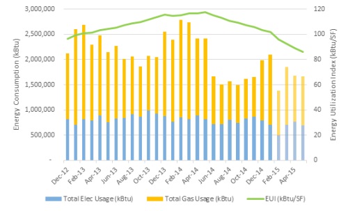 Figure 6. Energy Consumption Trending Example
 - Timeliness — How often should a report be issued? Ideally, as often as leadership requires. The key will be providing reported figures on a timely and consistent basis. This could be as frequent as monthly or as little as annually. This is key in setting consistent expectations for information flow. At the top-most levels, it conveys a professional demeanor by the Facilities department to the audience and lends credibility to the message. Within the department, it supports a consistent process for gathering and reporting information and conveys to staff the data they work to provide is useful and relevant.
Summary
Reporting is one of the best opportunities Facility Managers have to showcase the value of the profession. When metrics are based in the context of supporting organizational drivers, what remains is to use that data tell the right story. A great story has strong human element, is fun to read, and invites the reader in. Tuning the message to the report audience through use of well-honed language based in relevant data tied to visually interesting and compelling graphics that draw the reader into the story in an engaging and memorable way will galvanize support for facility management program initiatives.
Laurie Gilmer, P.E., CFM, SFP, CxA, LEED AP O+M
Laurie Gilmer is a Vice President at Facility Engineering Associates and leads FEA’s facility asset management, building energy management, and sustainability services. Laurie is chair of IFMA’s Sustainability Facility Credential scheme committee, chair of the Northwest Energy Efficiency Council’s Building Operator Certification program advisory committee, and an instructor for IFMA’s Sustainability Facility Management and Facility Management Professional programs.